Are Your Call to Actions Converting?
Have you ever really thought about your calls to action? No? Big mistake - using specific and clear calls to action can increase conversion rates by 161%.
Most businesses get calls to action (CTA) wrong. They use weak, generic, or vague CTAs on their pages and wonder why users don’t click.
They say things like Submit, Learn More, or Click Here.
But let’s be honest - why should anybody care?
Sure, if the context is right where you placed the CTA, the chances aren’t bad.
But your audience is busy and bombarded with options. And CTAs are responsible for driving action.
Meaning, if your CTA isn’t clear, they’re gone.
The Hack
That’s why you should craft your CTAs in a way that users never have to think twice about clicking it.
Your call to actions should be:
Clear – Say exactly what the user will get.
Precise – Avoid vague words.
Outcome-driven – Show the benefit of clicking.
For example:
Instead of Submit, say "Get My Free Report."
Instead of Learn More, say "See How It Works."
Instead of Click Here, say "Start Your Free Trial Today."
Let’s take a look at some CTAs in action (what a wordplay):
For example, the startup Hops uses a strong outcome-driven call to action for their solution:
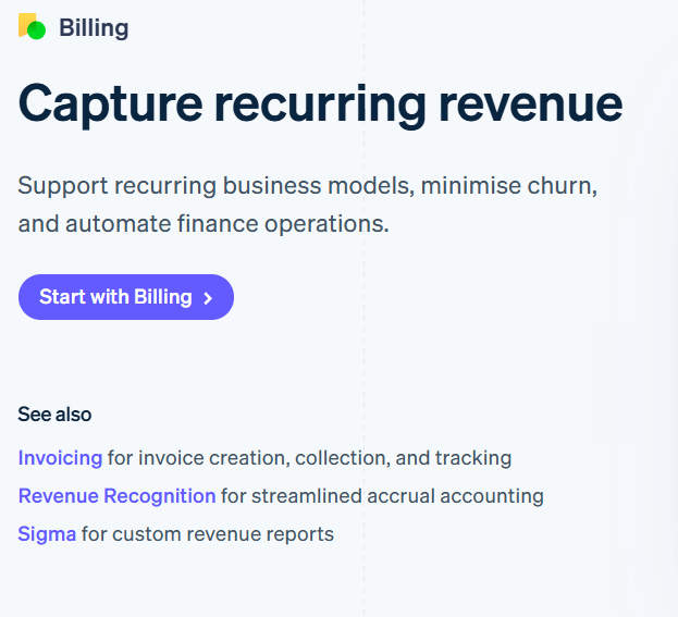
Stripe also does this well by making their CTA highly contextual. When introducing their billing solution, they seamlessly incorporate it into their call to action:
Or take Canva - we covered this in one of my recent articles. Each use case gets its own outcome-driven call to action on Canva’s website, like this one for video editing.
The Result
I know, I know.
You might be thinking, "You can overcomplicate call to actions, and I don’t want to overthink it."
But clear, outcome-driven CTAs lead to higher engagement, better conversion rates, and increased trust with your audience.
Don’t believe me? I’ve got you covered - I found some statistics to back it up:
Using calls to action in general can increase conversion rates by 161%.
Placing the CTA button at the end of a product page can increase conversions by 70%.
Increasing the size of the CTA button can boost click-through rates by 90%.
And now, the key point of this article: using a specific, clear CTA can increase conversion rates by 161%.
Takeaway
So next time you’re naming your call to action, maybe think twice.
When your CTA is clear, users don’t have to guess - they know exactly what to do and why it benefits them. This reduces friction, builds trust, and increases conversions.
Why does it work?
People are lazy – If they have to think, they won’t click.
Clarity converts – The more obvious the action, the more likely they are to take it.
It creates urgency – A strong CTA makes the next step feel inevitable.
See you next week! 👋🏼
PS: If you enjoyed this growth hack, please tap the like button below. Thank you! 💛


Having different calls-to-action in the same communication may leave customers feeling there is 'too much choice' and making a decision will take longer or result in no action taken at all.
A good rule of thumb is: One objective, one key message, one call-to-action.
Nice Andreas, this came at a good time for me. I am working on a client's landing page and the CTAs are a big element of it. Thanks for sharing!