
Canva's $2 Billion Sales Funnel
With 180 million users and $2 billion in revenue, Canva is one of the most well-known SaaS companies - and likely the most intuitive graphic editor. Here’s how it acquires customers.


Hi, it’s Andreas, and I’m back with Growth, my newsletter that dives deep into today's top startups' funnels and growth tactics.
Today, we’re covering Canva - a tool that probably needs no introduction. But someone who definitely does deserve an introduction is my friend Irene, whom I brought on board for this issue.
On her Substack, she analyzes website and app design through the lens of neuroscience and psychology. You should definitely check out her content - it’s AWESOME.
Now let’s jump in.
In 2024, Canva reached 180 million users globally. With 16 million premium users, it generated $2 billion in revenue, making it a heavyweight in the SaaS space.
All the more reason to take a closer look at how Canva’s growth and sales funnels work.
Quick Note
A classical sales funnel does not reflect how marketing and sales work. You cannot strictly separate content and channels that solely drive awareness from those responsible for conversions. However, for the purpose of this analysis, it is easier to break it down this way.
What a $2B Sales Funnel Looks Like
Canva is doing a lot in terms of sales and marketing.
No wonder - it's a widely used tool with a diverse target audience.
Looking at the website alone, we can identify several main target groups:
Students, teachers, & Universities
Single users
Teams & enterprises
But when navigating this jungle of activities, one thing stands out:
Canva follows a smart segmented marketing approach.
Instead of promoting Canva as a whole, they tailor their marketing to each target group.
This makes the sales funnel look like this (link to the full breakdown at the end).
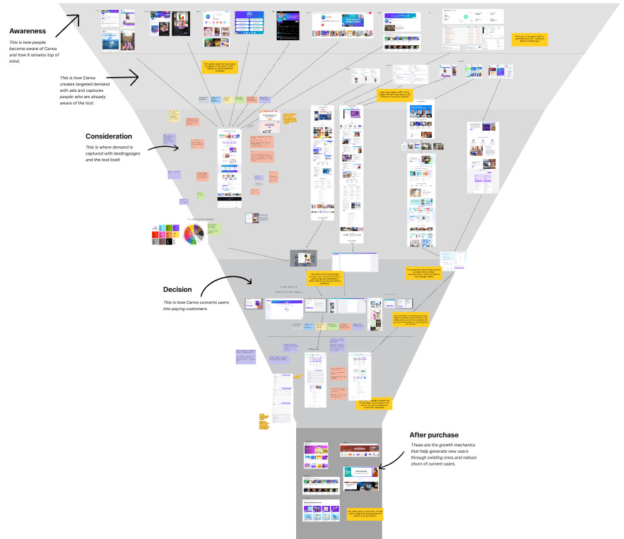
Let’s dive in.
How Canva Drives Awareness
Like every major tool with millions in funding and significant media buzz, Canva is in the fortunate position of not having to educate people about the tool.
It is mainly done by others:
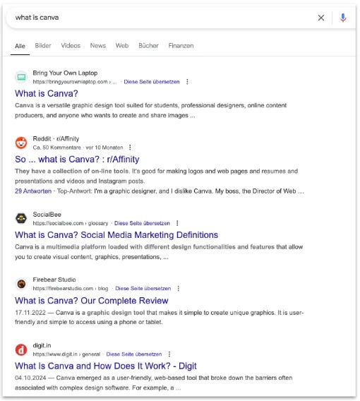
And this opens up a whole new playing field for Canvas's own content.
Which looks like this:
Instead of educating their audience about what the tool is doing, they focus on content for people who are already aware of the tool.
For example, on LinkedIn. Providing tips on how to use the tool:


But also playing with some memes - making fun of its target audience’s clichés:

The Same goes for X & Instagram:

While on X they are also trying some creative things - but unfortunately the crowd is dead:

And on Facebook.
But here’s something interesting.
Canva uses country-specific pages, at least for German- and English-speaking countries.
This allows them to reach a much broader audience.
The content here is mainly reels, but the topics remain the same - insights about the tool, engaging posts like riddles, and product updates.

What I really like is Canva’s Pinterest strategy - and, of course, it’s a design tool, so it’s predestined to reach an audience there.
But Canva showcases creative designs from the community, inspiring ideas, and target-audience-specific design drafts created with the tool itself here.

On YouTube, Canva is building a whole library of tips, tutorials, and how-tos - which have gained a lot of views.
And even when covering topics like "Hierarchy in Design" or "Create Videos with Photos," it's always done in Canva - sneakily connecting the content to the tool.

💡 Btw. this is a smart approach for your content strategy.
When creating content, think about how you can help your audience achieve a specific goal or solve a problem—just like Canva does with "Create videos with photos in minutes." Then, record a video demonstrating how to solve the problem using your tool.
Of course, this won’t work for every tool, but if it works for your tool it is a smart strategy to acquire users
But what stands out is Canva’s SEO strategy.
As I mentioned at the beginning, others are taking care of educating people about what Canva is.
So, Canva focuses on ranking its use cases and features in Google.
By using keywords like "website builder" or “custom business cards” Canva drives a HUGE
amount of traffic to its site.

With thousands of visits a month.

All of this helps Canva drive 191.5 million organic visits to its site, ranking for nearly 15 million keywords - which is insane!

And of course, with all this traffic, Canva’s website is optimized for conversion rates down to the last detail.
💡 When you start with SEO, you’ll probably come across expert advice like: “You have to find keywords for content that solves problems for your target group.” For example, if you run a product studio, this could mean writing articles such as “How to build an MVP?”
I agree with the idea that content should solve problems for your target group.
However, ranking for generic things like “How to build an MPV” won’t help you rank on Google anymore (in most cases). Search is saturated with this type of awareness-creating, top-of-the-funnel content. Marketers have been following this approach for years.
Nowadays, you should focus your SEO content around your product and create awareness through social media. That way, when someone Googles your product or product category, you’ll be the top result. This could include articles like “[Your Product] vs. [Your Competitor’s Product]” or “How to do X with [Your Product]”, and so on.
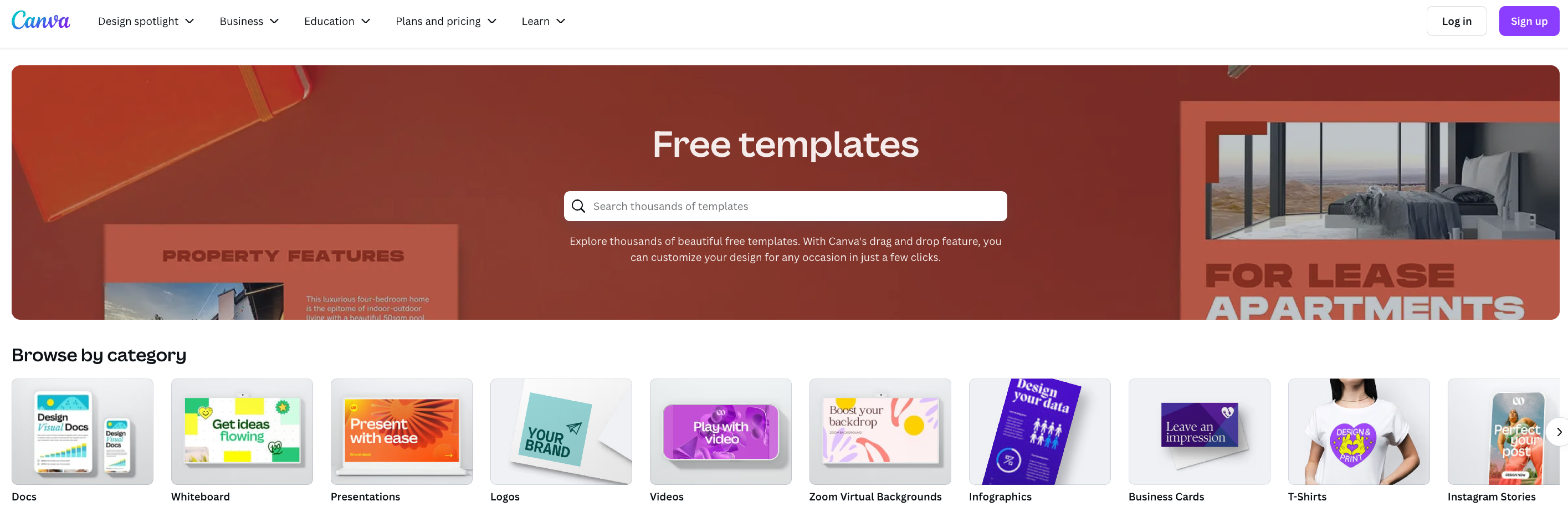
How Canva Converts Traffic on Its Website
Canva’s Homepage
Most of the traffic lands on Canva’s homepage first, which is well-optimized for lead generation.
To have a look at it, I’ll hand it over to Irene to analyze it from a neuromarketing point of view:

Canva’s homepage is as perfect as it gets. Check out this detailed breakdown here.
Here are the top things I want to cover about Canva’s landing page:
Visual perfection
Simplicity and Cognitive Ease
Emotional Connection
Built for Businesses
1. Visual Perfection
At a glance, the design is modern, clean, and consistent. They follow all the principles of visual hierarchy.
Even looking deeper, it is evident that Canva has dotted their i's and crossed their t's:
Structured grid system for balance and proportionality
Whitespace keeps things uncluttered and easy to navigate.
CTAs stand out with strategic placement, white space, and subtle micro-interactions.
Fonts are modern and readable, with no inconsistencies.
Icons and images are high quality, with clean placement and no visual clutter.
Perfect spacing and alignment, so nothing feels cramped or awkward.
2. Simplicity and Cognitive Ease
Do we understand what Canva is?
Their headline is:
What will you design today?
They are letting us know that whatever we want to design, they got us covered.
To be more clear, they go ahead and visually list all the use cases. This helps us see exactly how we can use Canva in our own work.
🌀 But could they improve the heading?
“What are you designing”
It’s open-ended and inviting, but could it be clearer? A bit more specific, something like “A tool to design anything and everything”
Maybe Canva is so well-known that they don’t feel the need to explain what they do. But for new users, a little more clarity might help.
Is Canva’s Homepage Easy to Scan? Is it simple to go through?
A study by NNGroup shows that people don’t read websites, they scan them instead.(In a study, 79% skimmed new pages, while only 16% read word-for-word.)
Canva gets this. Their homepage is built for quick scanning. Their homepage is optimized for scrolling and quick scanning of the text. How do they actually implement it?
Layout uses grids for clear structure which makes content easy to follow.
Follows an F-shaped pattern, and places key information where people naturally look

Also, Canva keeps text minimal and relies on visuals to communicate—the classic ‘show, not tell approach’. This is related to the Picture Superiority Effect, where people remember images better than words.
Is the Cognitive Load High or Low?
It’s low—and that’s a good thing.
3. Emotion Connection
Purple isn’t just a random choice for Canva—it’s strategic. In color psychology, purple represents creativity, ambition, and positivity, which fits perfectly with Canva’s brand. Their shade of purple even has a hint of blue, adding a touch of trust and reliability while still feeling fun and approachable.
Their copy is casual and inviting:
“Templates for absolutely anything” (Casual)
“What will you design today?” (Conversational)
“We’re full of surprises”. (Curiosity)
Together, the color and tone make Canva feel fun, creative, and reliable.
Overall, Canva doesn’t feel cold or corporate—it has a personality.
4. Built for Businesses
Yeah, Canva is a design tool for everyone. But their landing page makes it clear—they mean business. The homepage speaks directly to businesses.
Why?
Pricing is very B2B-centric, they have tailored options for
Canva Pro: Solopreneurs/freelancers
Teams: Medium to small companies, startups
Entreprise: Big corporations
Social proof highlights large companies across different industries, not individual creators or freelancers.
Testimonials are framed as ‘Business Wins with Canva’, reinforcing its value for companies.
A dedicated section—“Plans that get down to business”—makes it clear that Canva is a serious tool for professionals.

Even Educational institutions aren’t on the main page—they have a separate pricing section, reinforcing that the landing page is business-first.
This isn’t just about targeting businesses; it’s about earning their trust. Canva positions itself as a reliable, scalable tool for teams, startups, and enterprises that need high-quality design at scale.
Overall, Canva’s landing page is smartly designed—clean, scannable, and easy to navigate. Every detail, from layout to copy, keeps things simple while reinforcing trust.
Canva’s Landingpages
Andreas Just here again - If someone arrives from the mentioned Google rankings, they won’t land on the homepage. Instead, they’ll be directed to landing pages tailored to specific features and use cases.
Like this one for the “website builder" keyword:

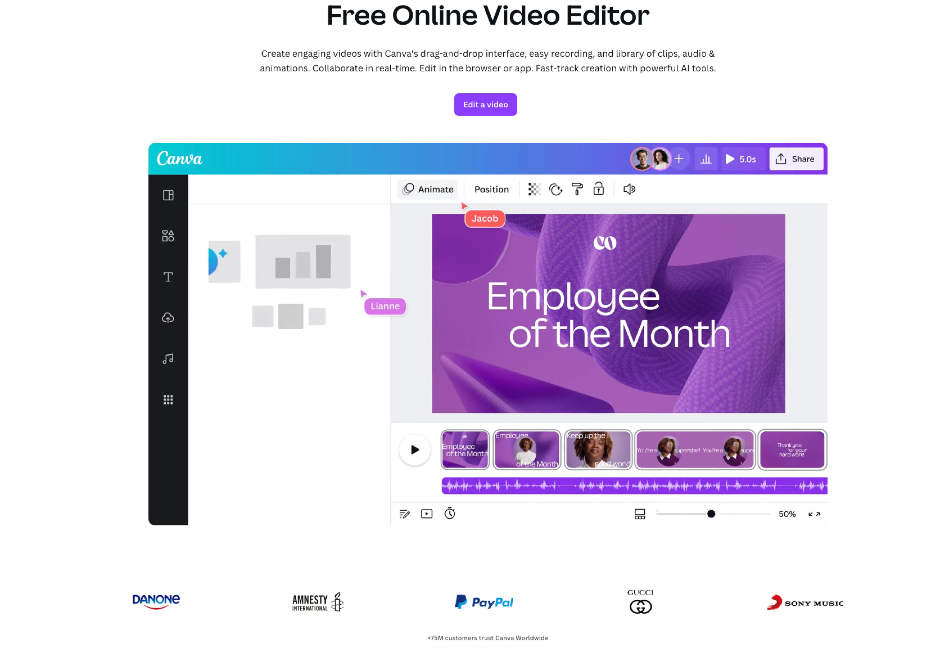
Or the one for the video editor:
All of these pages follow the same structure (full breakdown at the end of the article):
Header with a value proposition
Logo wall to build trust
Examples of things created with Canva
Features & benefits overview
Explanation of how it works
FAQs to answer important questions
6 to 9 call-to-action buttons guiding users to the free version of the tool
But what Canva does here is super cool.
For some use cases, like video creation, Canva lets users jump straight into the tool - without requiring them to sign up first.

The user can upload a video and fully edit it. But as soon as they want to use or save it, Canva prompts them to sign up.
At that point, they’ve already put in the effort of making the video —which means it is much more likely that they’ll complete the sign-up process.
On other landing pages, however, Canva forces users to create an account before they can use the tool at all.
This feels like a missed opportunity, and I don’t understand the inconsistency. As mentioned, when someone puts in the effort to edit an image, video, or anything else in the tool before creating an account, they are more likely to sign up after.

Meanwhile, the rest of the site is also very well optimized - as Irene states on the Navigation bar:

The navigation bar is clean, simple, and easy to use. It follows best practices with a minimalist design and plenty of whitespace. Nothing feels cluttered.
It keeps things simple with just five main options, following Miller’s Law (people can only remember about 5 to 7 things at once before feeling overwhelmed) —so you’re not overwhelmed with too much at once.
It also hides extra options until you hover, keeping the interface sleek while still offering depth when needed. Each section is carefully structured for quick scanning and familiarity.
This is what shows up when you click on “Design Spotlight”:

Overall, everything feels smooth, simple, and effortless to navigate.
So, to sum it up, with all of this—and 190 million monthly visitors—Canva seems to be doing pretty well in terms of conversion.
But how do they drive targeted demand to create revenue?
How Canva Creates Targeted Demand
Andreas Just: While the website captures organic traffic - seemingly driven by a broad multi-channel strategy - the more strategic and targeted approach happens one level deeper.
A look at Canva’s pricing page shows that it divides its pricing packages into sections for free users, solo users, and smaller teams & organizations. Another tab links to dedicated pages for schools & universities.
But when it comes to creating targeted demand, schools & universities are approached almost identically to enterprises.

This means we have these different target groups to look at:
Free/Solo users
Smaller Teams
Enterprise/Schools Universities
How Canva Targets Free & Solo Users
There is no explicit strategy for how Canva targets free and paying solo users, as they are not the primary revenue-generating group.
Therefore, free and solo users are mainly acquired in two ways:
Organic content (which is free for Canva and includes social media, SEO, and media buzz)
Google Ads (though these are also used to target teams and organizations)
For the latter, Canva also promotes these use cases and features with targeted keywords on Google Ads.

By clicking on it, you land on the same landing pages we discussed earlier - where users are led straight into the tool.
How Canva Targets Smaller Teams
This one is more interesting.
Even though the line between targeting solo users and teams is somewhat blurry.
From what I’ve seen, Canvas ads for teams include:
Google Ads – The same as those for solo users, capturing members of smaller teams as well.
LinkedIn Ads – Showcasing product features useful for smaller teams without specialized roles, such as video editing.

Meta Ads – Follows the same concept as LinkedIn Ads.

With Canva’s “team” strategy it is highlighting use cases that are essential for smaller teams without specialized graphic design roles.
Once you reach the landing page, the goal remains the same: convert users to the freemium version.
How Canva Targets Enterprise & Campus Users
This happens through a mix of Google and LinkedIn ads.
For enterprises, Canva uses LinkedIn ads to promote a webinar series featuring well-known companies and their executives. The goal is to educate other organizations on how to use Canva more efficiently.
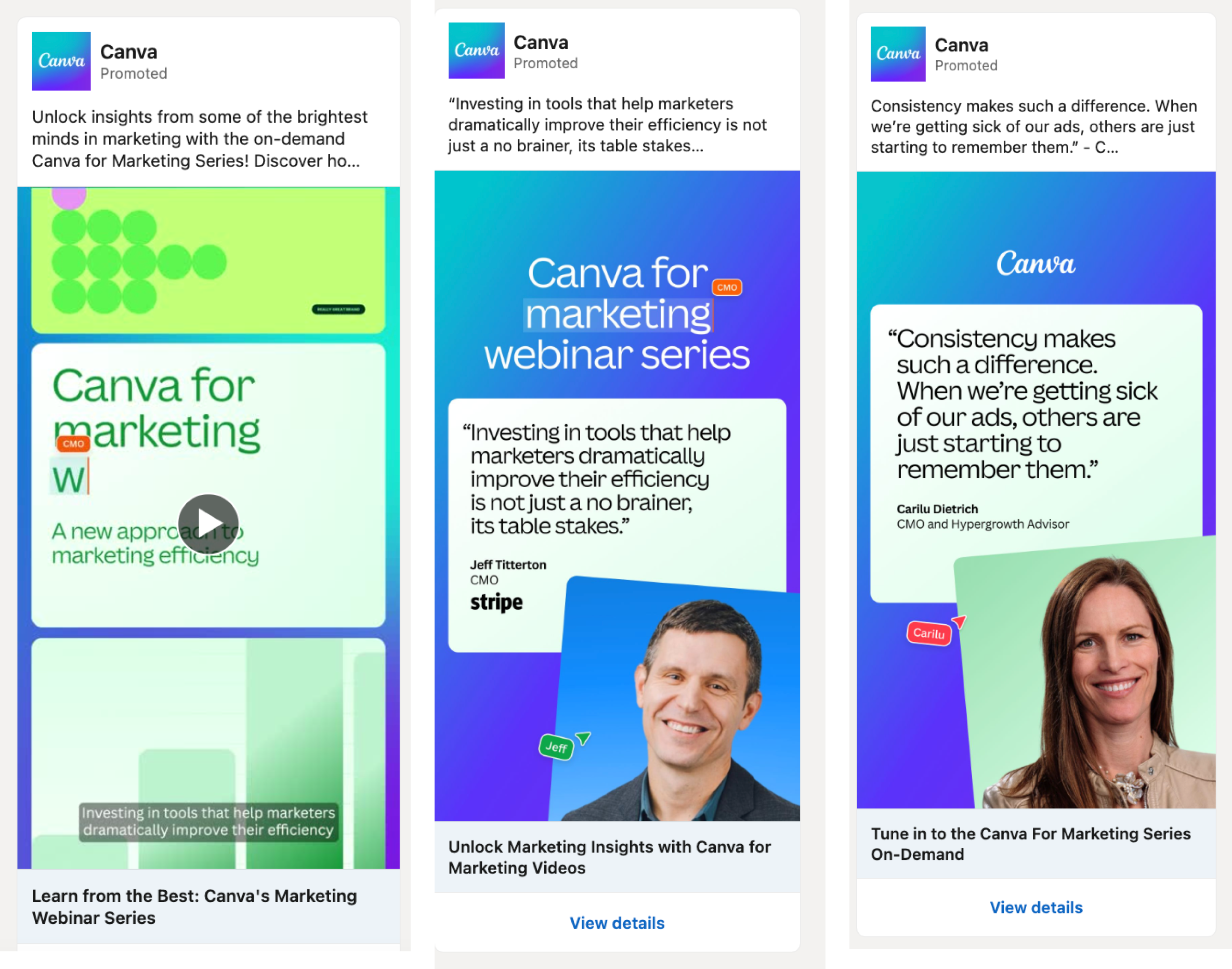
This leads to a landing page with a content library where you can explore these webinar series.

Once you land on the page, it appears that Canva has retargeting in place via LinkedIn Ads and the Google Display Network.

These ads lead directly to another landing page.

Unlike ads not targeted toward enterprises, the call to action here directs users to contact sales. This makes sense because enterprise packages are much more expensive, and the decision-making process involves convincing an entire buying center, making it more complex.
And with sales calls & personal contact Canva has a better chance to convert those customers.

For campuses and universities, Canva relies solely on LinkedIn Ads.
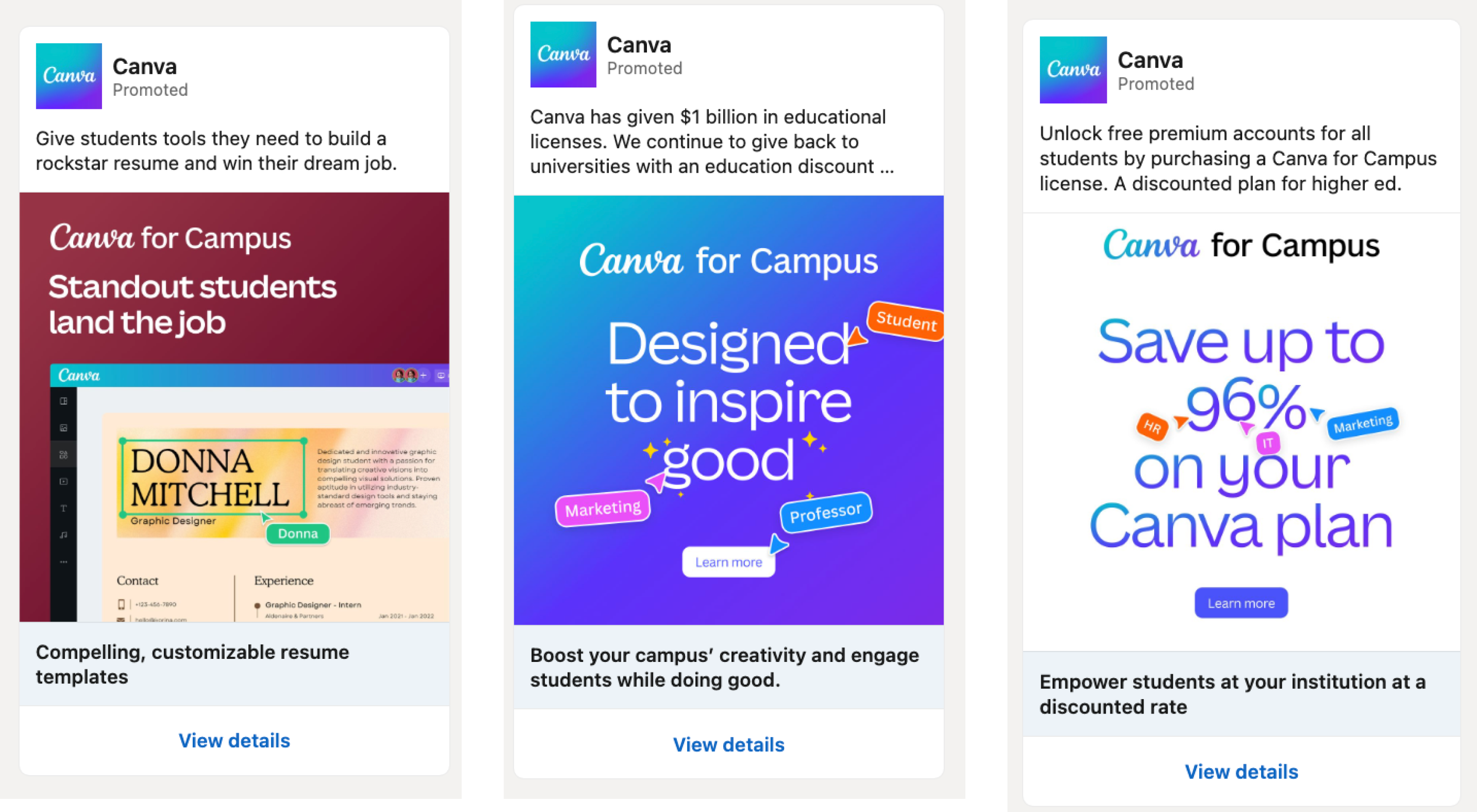
These ads also lead to a landing page with the same goal: contact sales.

💡 Speaking from my own experience, we have tested Google Ads and LinkedIn Ads extensively in the past. The best results we achieved were with an ad spend of around $3,500–$4,000, generating 200+ qualified leads per month at a cost per lead (CPL) of $18.
I would use these two channels in combination:
Google Ads, targeting high-intent keywords (i.e., keywords that indicate the user is ready to make a purchase) → Leading to a landing page that educates visitors about the offer and provides a conversion opportunity.
LinkedIn Ads → Retargeting landing page visitors by offering additional education and a conversion opportunity, or directly aiming for a conversion (to be tested).
Example: Canva
Google Ads targets the keyword “business card creator” (since users searching for this term likely want to create a business card). When they click the ad, they land on a page that explains what Canva does - but they don’t sign up yet.
LinkedIn Ads then retarget these landing page visitors with an ad related to the business card creator. The ad might say, “Sign up to create your business card.” Since the visitor has already engaged with the content and knows about the business card creator, they see the ad again and are more likely to sign up.
Google Ads generate awareness, while conversions happen on LinkedIn.
Where the Money Is Made - The Pricing Page
Handing over to Irene to have a look at how Canva makes money:
Canva’s revenue comes from two main strategies - upselling and selling to businesses.
Upselling – This happens when free users, like solopreneurs and non-business users, realize the value of Canva and upgrade to a paid plan. They start for free, see how useful it is, and decide it’s worth paying for.
Selling to businesses – Canva has tailored its landing page and pricing structure to appeal to companies. Everything is optimized to show businesses why Canva is a must-have tool for teams, making it easy for them to sign up and scale their usage.
We’ve already talked about how well-optimized Canva’s landing page is - now, let’s take a closer look at the pricing page. Let’s dive in.
Breakdown of the Pricing Page
Canva’s pricing page is designed to guide users toward deciding with minimal friction.

Here are the neuromarketing principles Canva uses:
Visual Hierarchy & Color Psychology
Smart Defaults & Status Quo Bias
Anchoring & Price Framing
Loss Aversion
Social Proof
Progressive Disclosure
Halo Effect
Building Brand Loyalty at an Early Age
1. Visual Hierarchy and Color psychology
The page is structured to be easy to scan and process, making decision-making feel effortless.
Strong Visual Hierarchy – Key details (plan names, prices, and benefits) stand out, making comparisons simple.
Color Psychology – The free plan is gray, while paid plans use Canva’s signature purple, subtly reinforcing value and importance.

2. Smart Defaults & Status Quo Bias
Canva doesn’t wait for users to explore pricing—they guide them toward the most valuable option from the start.
The Business Pricing tab is the default, directing users toward high-value plans.
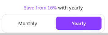
Yearly plans are preselected with a prompt to "Save 16%," leveraging default bias to encourage long-term commitment.
Most people stick with what’s already chosen for them. Canva leverages this instinct effortlessly, nudging users toward higher spending without resistance.
3. Price Framing
Canva doesn’t just show you prices—they frame them strategically to make the higher-tier plans look like the smarter choice.
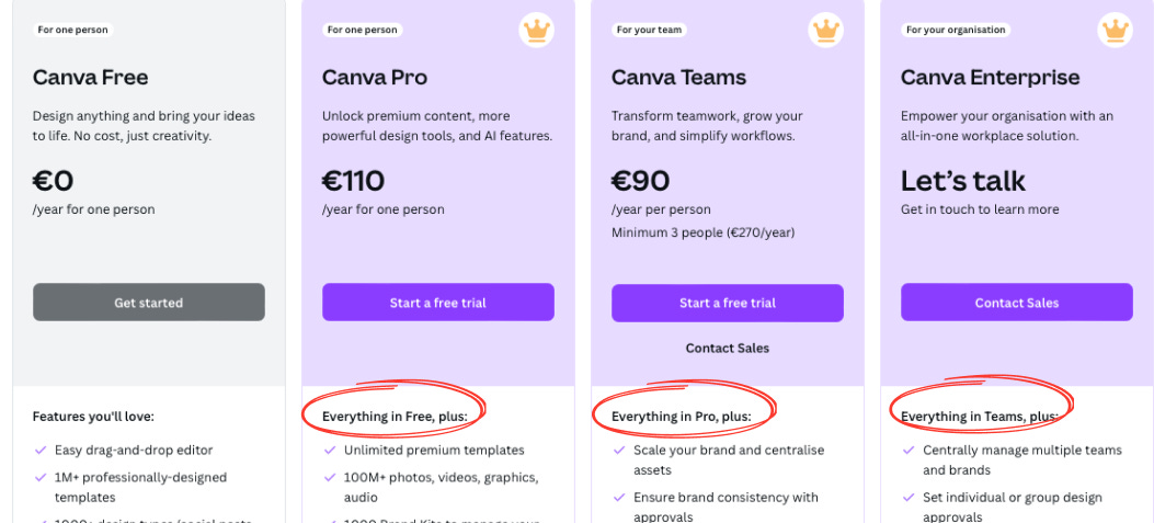
At first glance, Canva Teams seems like the better deal:
Pro: €110/year per person
Teams: €90/year per person
But is it actually cheaper? Not really. Canva Teams requires at least 3 people, which means the minimum cost is €270 per year.

By framing Teams as a "cheaper per person" option, Canva makes it feel like a better value—even though the total cost is higher.
It’s a textbook example of price framing—shifting focus from total cost to perceived savings.
4. Loss aversion
Canva taps into loss aversion—the idea that people are more motivated to avoid losing something than to gain something new.
Free Trial Strategy – By offering a risk-free trial, Canva removes hesitation. Users get access to premium features, making it harder to go back to the free version.
"Everything in Free, plus…" Strategy – This upgrade path makes it easy to see what users would lose if they don’t upgrade. Higher tiers clearly offer more value, reinforcing that sticking with a lower plan means missing out.
5. Social Proof: Building Trust and Reducing Uncertainty
Canva uses social proof to reassure users and make decision-making easier.
FAQs anticipate concerns – By answering common questions upfront, Canva removes hesitation and builds confidence.
Trust through numbers – Highlighting that 6 million teams use Canva reinforces its credibility.
Logos from well-known companies – Seeing trusted brands using Canva makes new users feel more comfortable signing up.


6. Progressive Disclosure through Separation of Business and education page
Instead of overwhelming users with all information at once, separate tabs for Education and Business Pricing help users find what’s relevant without clutter.
Each pricing page is tailored to its audience:
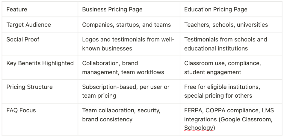
Canva keeps things clear and clutter-free, making sure every user gets the info they need without distractions.
7. Halo Effect
Because Canva is free for Teachers, Schools and Districts, it feels like more than just a business—it comes across as a brand that truly supports learning and creativity.
This builds trust and goodwill, making people see Canva in a positive light. And because of this, Users are more likely to trust and prefer Canva over competitors, even in non-educational contexts.

8. Building Brand Loyalty at an early age
When students learn and create with Canva from a young age, they become comfortable with the tool. they’re more likely to prefer and advocate for Canva when choosing a tool for work/business.
What they can improve?
The Overwhelming Feature Comparison While most of the page is optimized for ease, the feature comparison chart is visually overwhelming and adds unnecessary complexity.

There are just too many features crammed into the comparison table—90+ across 10 tabs. Instead of making things clearer, it creates cognitive overload, making it harder for users to spot what really matters.
The endless checkmarks don’t help either. The repetition makes it feel overwhelming, and the real differences between plans get lost in the noise. Also the thing is that most of the features in the last 3 plans are similar. The biggest difference comes down to company size and number of teams, but the way it’s presented makes it seem way more complicated than it actually is.
So how can they improve it?
Instead of listing every single feature, Canva could focus on what businesses actually care about:
Pro: For solopreneurs and small teams who need advanced design tools.
Teams: For growing businesses that need collaboration tools.
Enterprise: For large organizations that need security, brand control, and large-scale collaboration.
Overall, Canva’s pricing page is designed to convert users efficiently, but simplifying the feature comparison could make it even more user-friendly.
Upselling From Within the Tool
When you start using Canva's free trial, the upselling begins—smooth and its almost unnoticeable. This is how:
Freemium Model
Canva’s freemium model is designed to get you hooked on the free version, letting you explore and create without restrictions at first. The catch? As you invest time and effort into your designs, you start encountering premium features that make everything easier.
By the time you realize you need those Pro tools, you’re already committed. And that’s exactly the point—once you're in, upgrading feels like the natural next step.
You get to see exactly what you miss if you don’t go for Canva Premium.
Canva doesn’t block premium features completely—they just tease you with them. You’ll see Pro templates, fonts, and AI tools sitting right there, but they’re grayed out or watermarked. Just enough to make you want them. You get to see exactly what you miss if you don’t go for Canva Premium.

You can even try using them, but when you go to download, that paywall pops up. By then, you’re already invested in your design, and upgrading feels like the only way to get what you truly want.
Right nudge at the right time
Canva knows the perfect time to ask you to upgrade - right when you need it most.
You’re in the middle of designing, you click on a Pro feature, and boom—a pop-up appears, reminding you what you're missing.

Overall, think that Canva doesn’t push you to upgrade - it makes you want to upgrade. By letting you explore for free, teasing premium features, and showing you exactly what you’re missing, they create a natural pull toward Pro.
After Sales: How to Keep Users Around
Andreas Just taking over, coming to the end of the funnel:
Canva uses a variety of strategies to keep users engaged and encourage frequent use of the tool— and, of course, increasing the chances of converting them into paying customers.
One of these strategies is Canva’s Design School, where users can complete courses and even earn certificates.
All, of course, within Canva.

Or tutorials on how to get started with Canva—guiding users step by step so they don’t feel lost. And, as mentioned earlier, a whole collection of additional tutorials is available on YouTube.


What’s cool and super helpful in keeping users engaged with Canva is its templates. By offering fully customizable templates that can be edited with just a few clicks, Canva eliminates the struggle of staring at a blank page.
This is especially helpful for less creative users, enabling them to create designs quickly and stay motivated to keep using the tool - which btw. is Canvas's whole mission:
“Launched in 2013, Canva is an online design and visual communication platform with a mission to empower everyone in the world to design anything and publish anywhere.”
One other thing to highlight here that happens inside the tool is the loss aversion tactic it uses as soon as someone tries to unsubscribe - mentioned here in my Growth Bites series:

Final Words
Like every other funnel, Canva’s funnel isn’t linear either. You might see an ad, click on it, forget about it, then read about it again. Eventually, you sign up. Where and how you enter the funnel - and when you convert - is unpredictable.
But by breaking it down, we see that Canva uses different tactics for different stages of the customer journey. More importantly, it promotes different things to different target groups.
Irene: Canva’s UX feels effortless—everything is smooth, clear, and naturally guides you. They make it clear that they are targeting businesses. You’re never overwhelmed with too many choices (except for that one pricing table). And you are never stuck searching for what you need.
Overall, Canva’s user experience is built for simplicity, speed, and seamless conversion.
Key Takeaways
Tailor your messaging
Address your customers with success stories, use cases, and features that are relevant to them. If you have multiple target groups, promote them separately. Don’t try to fit everyone into one bucket—create content, strategies, and activities specifically for each group. Just like Canva does with its webinar series for marketers.
Focus on retention.
Think about what your users need once they’ve signed up—and how you can keep them engaged. Canva does this with a design school and tutorials, guiding users step by step as they explore the tool.
What can you do to achieve the same?
See you next week! 👋🏼
→ Click here to access the full, free funnel breakdown
 | A guest post by
|
Wonderful analysis of their funnel. And you‘re right, the ABM approach helps so many businesses as well as consumers to find value. I use it for 8 years and love this proud Aussie invention 🇦🇺
Canva is amazing to use and it is by far one of my favorite tools. Even for free, you can get a lot out of it.